
When I sat down to make the first page of Disconnected, I had to make a number of formatting choices. As with any choice, they carried with them both benefits and drawbacks, which I hope to discuss here. First, let’s identify some of those choices:
Page dimensions

Opting to orient the page as landscape seemed like a no-brainer to me — this was conceived as a web comic, which means folks would mostly be reading it on screens. Landscape felt like it would take advantage of screen space better. Additionally, I had just finished reading Chris Ware’s Lint, which made stunning use of its landscape pages. I doubt Disconnected will read anything like Lint, but it serves as an important formal inspiration for what I’m trying to do.
Freed of any printing dimensions, I mostly had to settle on an aspect ratio, I settled on a golden rectangle (or something close to it), partially because I’m such a nerd, and partially because I thought it might give me some flexibility in layouts, allowing me to embrace squares and golden points naturally as the series continues.
Grid
Every comic I’ve ever drawn has been built on a grid. I think they’re incredibly useful for controlling pacing and emphasis, and they appeal to my sense of logic and order. This would also help establish an aesthetic for the series and help give me a substantive starting place for each new page — each layout would be a variation on a theme, rather than a whole new undertaking.
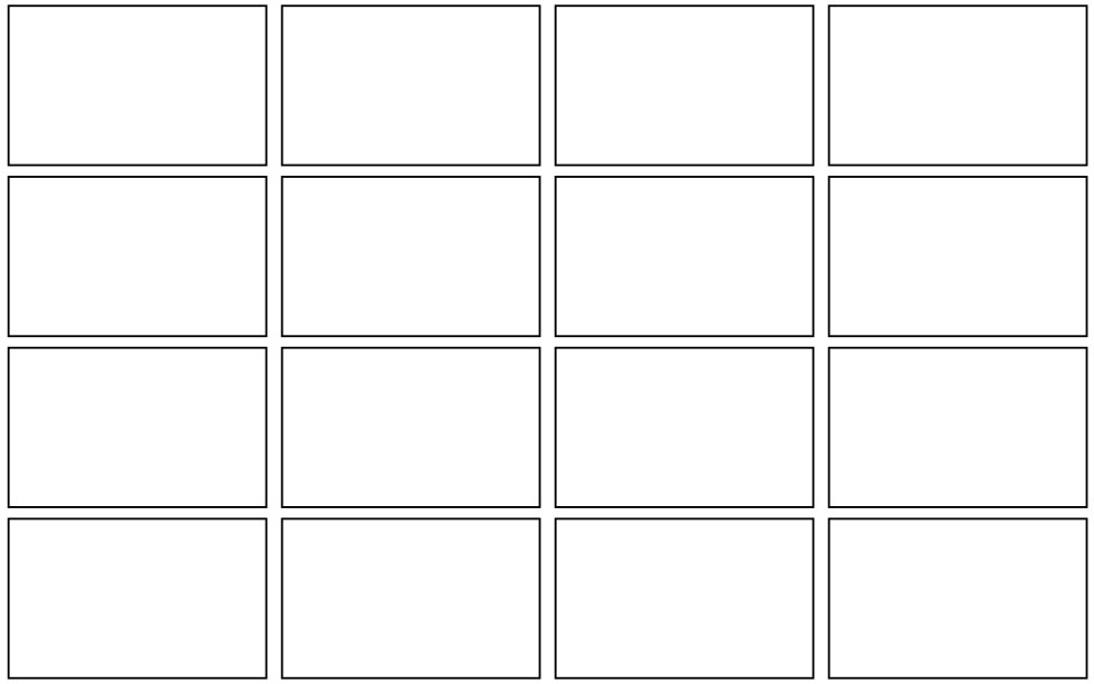
I could have opted for a 9-panel grid, or some non-square number, but as I was laying out the first page, 16 fit my needs a bit better. It’s a lot of panels per page, but I very rarely actually have 16 panels on the page — it’s just the starting point.
One thing I hadn’t really considered when combining a landscape format with a 16-panel grid is just how different pacing is. The rows in a 9-panel grid can’t help but flow together — a feature savvy comics makers can use to create discrete story beats. There’s no better example than Watchmen, so forgive me for using it to illustrate this point.
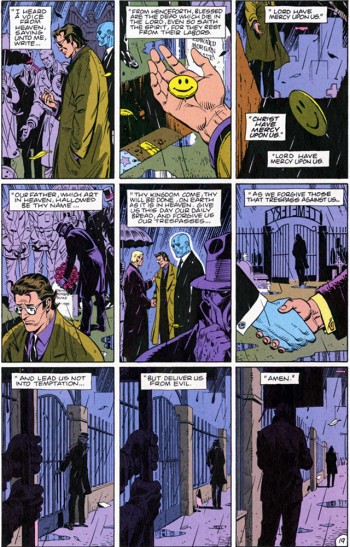
Part of why this works is that we can easily see all three panels in a row at once — we automatically group them because of it. That doesn’t work as well when there are more panels, and it works even less when the panels are wider than they are tall. It’s just harder to take in as a unit. To look across just a single row in Disconnected forces your eye to move, losing that sense that the panels naturally fit together.
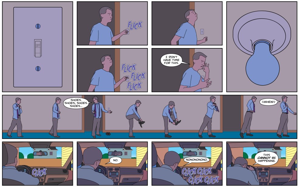
I’m already framing that as a negative, but there are benefits, too. The way the format forces the readers eye to move can create a sense of motion I don’t usually achieve in my comics. That is; it can be used well, but I requires a set of skills I’m mostly just picking up on. Look at how poorly I handle it early on:

The three panels in the bathroom might fairly be read as a group, but I couldn’t muster any real flow in the rest of the page, opting instead to lean into the disjointedness, resorting to a kind of hard-cut montage.
Each page since has addressed the grid in different ways, but as far as creating meaningful groupings, none pleases me more than my most recent page:
The double-tall panels that frame the top half of this page are an affect borrowed from Ware, but they do a remarkable job of framing the four panels between them as a natural group. Moreover they provide a contrast to the full-width rows that follow, highlighting just how wide they really are.
One element I’m still struggling with is just how far the eye has to travel to start the next line — it’s much harder to build flow, or even direct the eye backwards naturally. Thus far, I’m inclined to think scene-to-scene breaks (or at least significant changes of “camera” angle) are my best option, but I’m looking for other ways to tackle that particular oddity.
